iOS 16 Initial Impressions: Such Horsepower, Much iOS
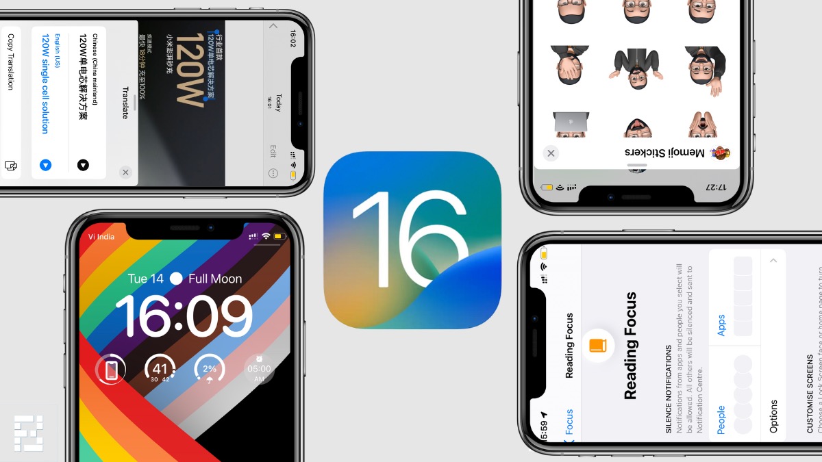
iOS is one of the main reasons people buy an iPhone. It is among the simplest OSs and comprises security and privacy features. As of now, I got my hands on the iOS 16 Dev beta, and here are my initial impressions of the same.
I’ve divided it into a couple of segments, starting from cosmetic changes, then going up to new features, limitations of the dev beta, and my final comments on iOS 16.
Looks new, is new
iOS 16 brings a refresh to the lock screen, and that’s my favorite part of the update so far. I’ve been customizing, adding multiple lock screens, changing through the day, and I still haven’t fully explored all the possibilities.
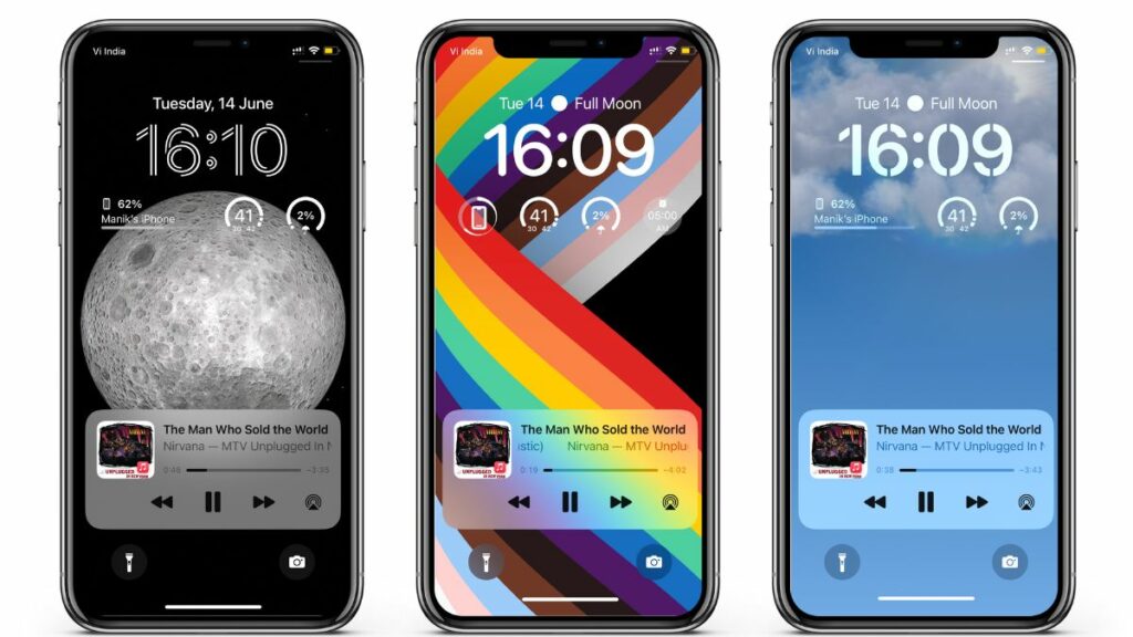
The notifications and music controls sit at the bottom, while widgets take the screen’s top section. I like the font options for date and time as well. You can even set the wallpaper to overlap a part of the clock if you like it that way, which is neat.
Then once you unlock the phone, there’s the app drawer. So far, you can access Spotlight search by swiping down from anywhere on the home screen. Now, you can also access it by tapping the horizontal dots at the bottom.
Coming to notifications, you now have them neatly tucked at the bottom of the screen. As a long-term iOS user, I never thought I’d see my wallpaper while playing music. With everything at the bottom, the wallpaper has its rightful place.
However, music controls are a bit finicky at the moment, as the screen keeps locking while changing tracks. But since it is a dev beta, some bugs and limitations are okay.
Diving deeper
It is safe to say that the lock screen is the biggest cosmetic and customizable change in iOS 16. However, this isn’t the only change here. And there are layers to the lock screen customizability as well, so let’s talk about the features one by one now.
Focus
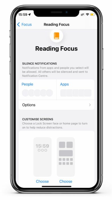
Lock screen customizability goes all the way into Focus as well. When you set up a Focus on iOS 16, you can customize the lock screen accordingly as well. Focus also adjusts your home screen and notifications to let you organize your time.
Copy text from video and translate
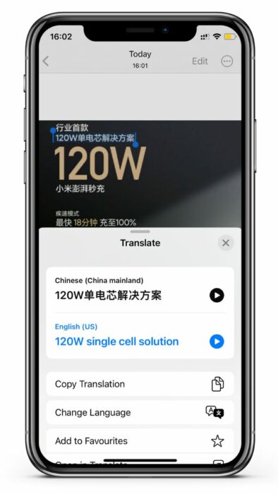
I often come across leaks on Weibo or reports from Korean publications. While you can translate most of it from the browser itself, photos are particularly painstaking to translate. iOS 16 lets you select text in photos and translate it with the click of a button.
It is fast, convenient, and works on video as well. You can pause a video, select the text in the frame, and translate it on the fly.
iOS 16 Privacy Features
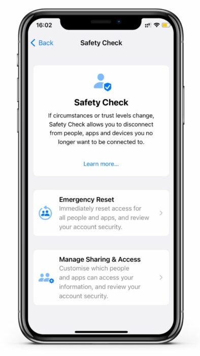
iOS 15 privacy features were groundbreaking, and iOS 16 is building on top of those. This time, Apple has added Passkeys and Safety Check, two features that make iOS 16 more secure and safe in times of emergency.
The Safety Check feature lets you safeguard your data in a messy situation and signs out of every other device so only you have access. Passkeys, on the other hand, replace passwords with a locally stored, more secure alternative.
Honorable mentions
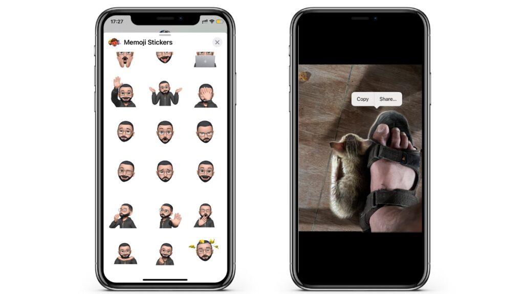
Aside from the customization and privacy options, Apple had added some neat new tools on iOS 16. It brings new Memoji sticker poses and a tool that lets you copy the subject from a photo and paste it into messages or make a sticker.
It also brings Hide My Email to QuickType suggestions, so your email ID remains private. FaceTime has also received features like FaceTime handoff and live captions in FaceTime calls. You can even collaborate on notes and documents while on FaceTime now.
Best of all, it now lets you copy an image or part of an image and paste it anywhere you like. For instance, you can copy part of an image and paste it into the notes app. While this feature would work far better on the iPad, it is also a welcome addition to the iPhone.
iOS 16 initial impressions; rounding up
My iOS 16 initial impressions are generally positive, as Apple has given some customizability options. However, some features should’ve made their way to iOS 16. The latest iOS feels fluid, fast, and a delight to use.
It builds on iOS 15’s features and makes the iPhone smarter and more capable. Every Apple service has received a certain upgrade or refinement to make it stand out with iOS 16.
However, despite the entire modern iPhone lineup packing OLED displays, Apple still hasn’t given us an Always-on display. The lock screen customization is also limited as you can’t change the torch and camera icons at the bottom. They should’ve been customizable too.
Coming to lock screen widgets, too, there’s limited space and limited widgets to choose from. It is still not as free as Android, and you can’t customize it outside Apple’s set template. I wish Apple would change this in the stable rollout and allow us to add more widgets on the lock screen.
Lastly, iOS 16 is the most one-hand-usage-friendly iOS I’ve used. However, it misses out on split-screen apps and multitasking capabilities. If you own an iPhone Pro Max, you’ll like the new touches, but Apple still won’t let us use the full power of the iPhone.
So rounding up, iOS 16 is good but still iOS. There’s customizability, but Apple limits it, and there are some great features that the company has just skipped. However, this is the first developer’s beta, and we can expect more changes to come.
If you’ve also tried iOS 16 beta or will try it in the future, share your views with us in the comments.


