After 12 Years, YouTube’s Logo Has Changed For The First Time | New Features Are Here
In an announcement made yesterday, YouTube revealed some significant changes implemented across various platforms where the service exists.
Also Read: What Is A “Certified Android Device”?
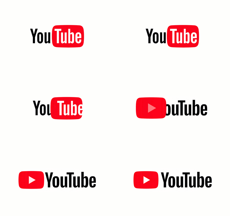
The very first one is a completely redesigned logo which is now in the form of the well-known play icon and YouTube written next to it.
The company says they made the new logo to fit different scenarios. For instance, when there is a scarcity of space on the device’s screen, the Play Icon itself can represent the complete logo.
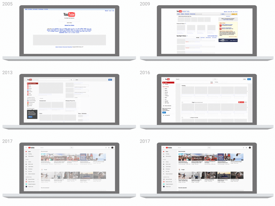
YouTube’s overall look has also seen many changes over the years, the latest one is inspired by Martial Design which was originally meant for Android devices but later made its way to other Google products. For desktop, the new design is rolling out as we speak and its complemented by YouTube’s cinematic Dark Theme.
What’s new for smartphones
Another set of new features is coming to the YouTube app, adding to the recently added new chat feature which allows users to share videos and texts.
Visual updates to the YouTube have made it less red than earlier as the color of the header is white now. The navigation tabs can be found on the bottom of the screen now. This is accompanied by the addition of a new Library and Accounts tab which also does the work of its earlier counterpart.
The ability to change the speed of the video playback has been there on desktop YouTube. Now, the YouTube app has incorporated this functionality.
New video suggestions also feature as a part of the update. When watching videos in full-screen, you swipe up from the bottom of the screen to view the recommendations made by YouTube.
YouTube already introduced a couple of gestures earlier this year. Users can double-tap to rewind or fast forward a video for 10 seconds. In the future, they’ll add the ability to play next video by swiping right and left to watch the previous video.
What else they are testing is different shapes for videos which adjust according to the size of the screen. They could be the regular rectangle or the long verticle ones like you see on Facebook.
What are your views on the new YouTube logo? Drop your thoughts in the comments.
Also Read: 18 Great Android O Features Which Will Make Your Life Easier

