New Windows 10 Start Menu Design Is Here To Make Things Simpler

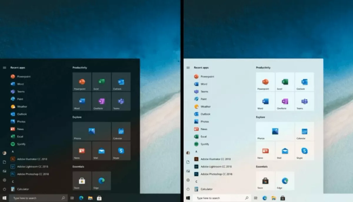
Microsoft has unveiled the new start menu design for Windows 10 in a Windows Insider podcast. The new start menu uses a simplified approach with less chaotic colors and less focus on live tiles.
Basically, Microsoft isn’t giving up on Live tiles; instead, it is using fewer colors in blocks to make the Start Menu look more uniform and refined.
The company has already scrapped live tiles from the Windows 10X. However, Brandon LeBlanc, senior program manager at Microsoft, made it clear that live tiles aren’t going anywhere in the main desktop OS.
“Live tiles are not going away, we have not announced anything of the sort. Those that enjoy their live tiles will continue to be able to do so,” said LeBlanc.
The Verge found out from an unknown source that Microsoft hasn’t planned anything on live tiles as of yet. However, the feedback from the changes in Windows 10X will determine the future.
The new start menu is a lot different from what we have now. It lets you pin apps and shows you a list of recent documents.
Also, it looks like Microsoft is on a spree to change the existing interface of Windows 10. That is because this new start menu comes right after the company started rolling out new icons for the Windows 10 1909.


