MIUI 12 First Look: UI Changes Leaked Through Beta Settings App
Xiaomi revealed the official logo of MIUI 12 at the start of this year. Since then, hundreds of rumors and leaks have surfaced online.
Recently, developers announced that Xiaomi has stopped working on MIUI 11 beta development, implying that MIUI 12 has become the Chinese manufacturer’s priority.
Now, we have another leak that showcases the UI changes users will see in MIUI 12. This comes straight from the Chinese MIUI Community forums, where developers uploaded screenshots of MiSettings app beta version.
This is part of a tradition where MIUI developers share the beta versions of several MIUI apps. However, this one seems accidental since the post has been redacted from the forums.
Moreover, XDA developer kacskrz observed that the new changes are radical compared to the previous version of the app, meaning that the UI changes might be part of MIUI 12, after all.
New changes in MIUI 12
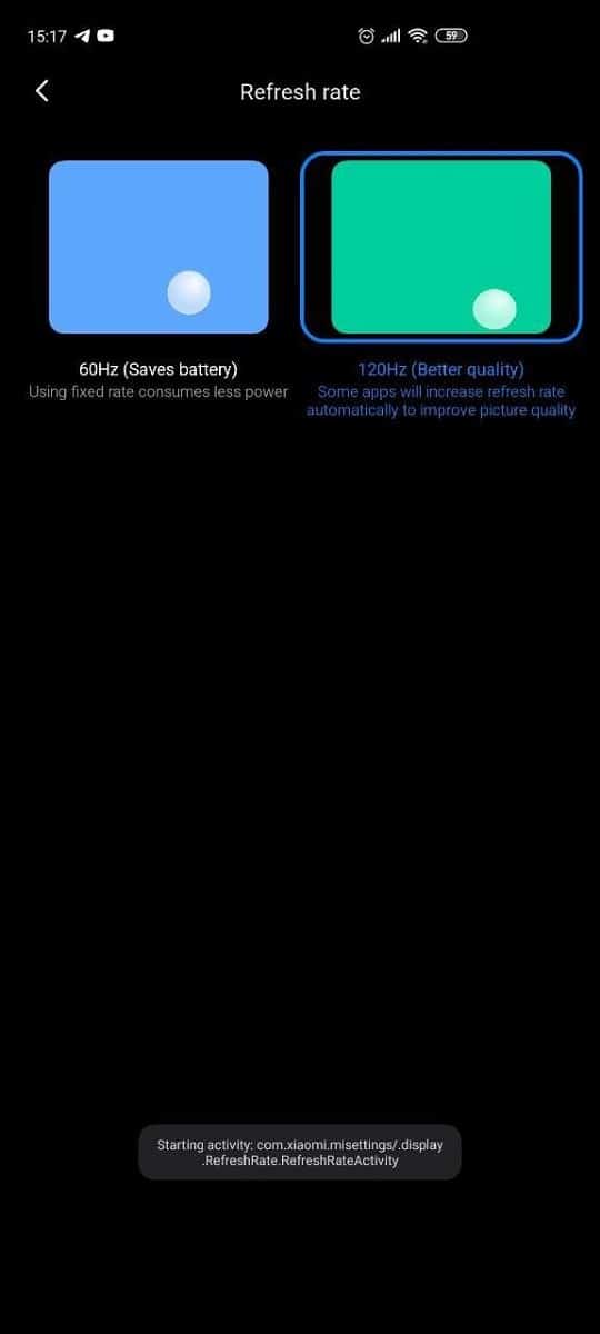 If you look at the screenshots, there is a new Refresh Rate settings landing page with animated boxes for choosing a particular Refresh rate.
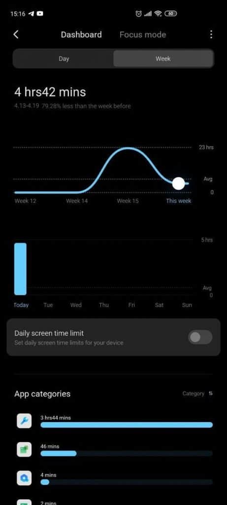
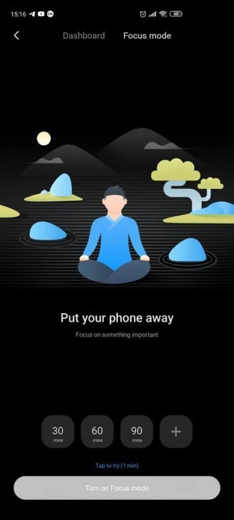
MIUI’s Screentime shows weekly usage in the form of a graph style as opposed to simple bars in the previous version. Other than that, there is individual app usage and a cleaner UI overall. There is also a Focus mode tab right next to the Screentime dashboard.
Small design changes can also be seen on the advanced display settings page. Of course, this is just the tip of the iceberg, and we will likely see several more UI changes in the final version of MIUI 12.
Since Xiaomi hasn’t confirmed any of the leaks, there is no saying whether all the changes talked about until now will be part of a new MIUI 11 update, or will directly land on MIUI 12.

