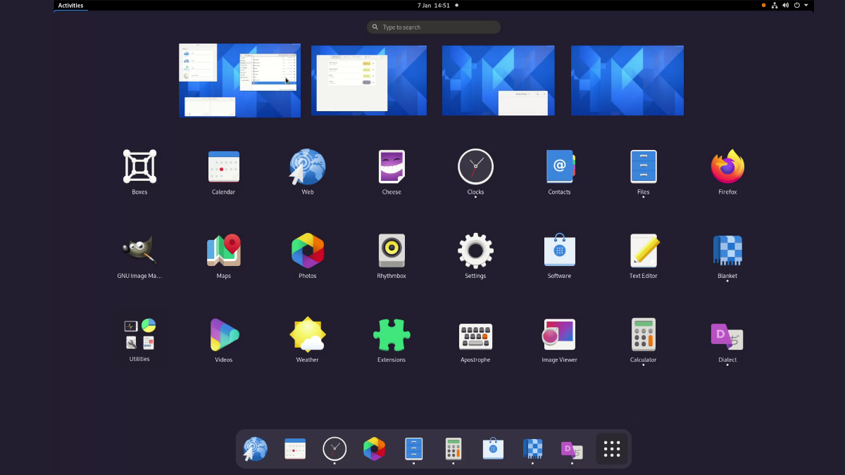
GNOME 40 Shell Preview With New Design Shows Up

In mid-December last year, GNOME UX Team leader Allan Day shared the Activities Overview’s completely new design mockups for the upcoming GNOME 40 desktop to be released in March 2021.
Now, he has come up with yet another GNOME shell UX update that you might see in the next GNOME version 40. As shown in the design mockups, a change in the workspace orientation from vertical to horizontal has now entered the development branch.
A sneak peek of the current development is shown in the below video with GNOME running in a Virtual Machine.
However, the new design has also raised questions and concerns for some users regarding the workflows. To answer that, Allan says, “the changes that are being introduced are actually quite limited.”
You can still access the overview’s elements: Search, Dash, and App Grid, the way you used to before (using Keyboard shortcuts as well) except its orientation structure, which is now horizontal.
Allan has also shared some points for those who want to know, “how is the new design better for me?”
- A more welcoming experience by replacing a blank desktop with an overview and favorite apps
- Effective touchpad gestures for better navigation
- Easy and understandable workspace as “screens” for new users
- Fully rearrange-able app grid using drag and drop
- App icons in the window overview
- Show full title of the application while hovering on its launcher
If you still have other questions for GNOME 40 shell design, check out the Q&A by Allan Day, where he has answered how the window drag and drop between workspaces will work, will there be an option to restore the old design, and how will the new design affect multi-display setups?


