Android 2.3 ‘Gingerbread’ Is Finally Dead!

The Android version 2.3 Gingerbread that refused to give up until last year has finally left the Android distribution chart, according to the April figures.
Google’s Android Distribution dashboard determines the percentage of devices running a particular Android version. Last month, Google killed the dashboard silently, leaving users with no choice but to look at the version adoption stats through Android Studio.
| Android name | Android Version | Distribution Percentage (May 2019) |
| Gingerbread | 2.3 | 0.30% |
| Ice Cream Sandwich | 4 | 0.30% |
| Jelly Bean | 4.1, 4.2, 4.3 | 3.20% |
| KitKat | 4.4 | 6.9% |
| Lollipop | 5, 5.1 | 14.50% |
| Marshmallow | 6 | 16.90% |
| Nougat | 7, 7.1 | 19.20% |
| Oreo | 8, 8.1 | 28.30% |
| Pie | 9 | 31.30% |
In May 2019 update, Android 2.3 Gingerbread had a usage share of 0.3%. That time, it seemed a good sign since it was a 0.1% jump from October 2018 update.
But since Gingerbread doesn’t appear in the Android version distribution latest update, it is safe to say that Android 2.3 usage has dropped to less than 0.1%.
Not many people know that Android Gingerbread was a major milestone for Google. After launching in 2010, the version took the overall Android market share to 50% by the end of 2011. Gingerbread brought NFC, support for larger screen size, a download manager, and much more.
In fact, copy-pasting between Android apps wouldn’t be possible without Gingerbread. It is no surprise that the Android 2.3 remained in the distribution dashboard for nine years after its launch.
What about other Android versions?
| Android name | Android Version | Distribution Percentage (April 2020) |
| Ice Cream Sandwich | 4 | 0.20% |
| Jelly Bean | 4.1, 4.2, 4.3 | 1.70% |
| KitKat | 4.4 | 4% |
| Lollipop | 5, 5.1 | 9.20% |
| Marshmallow | 6 | 11.20% |
| Nougat | 7, 7.1 | 12.90% |
| Oreo | 8, 8.1 | 21.30% |
| Pie | 9 | 31.30% |
| Android 10 | 10 | 8.20% |
Since Android 3 Honeycomb left the dashboard a long time ago, the lowest market share is now of Android 4.0 Ice Cream Sandwich (ICS) with 0.2%.
Meanwhile, Android 9 Pie comprises the biggest market share with 31.3% and Android 8 Oreo is second in line with 21.3%. It looks like the usage share of Android Pie has increased exponentially since May 2019.
A big reason behind this is Google’s Project Treble program that modularized the OS in a way that made it easy for manufacturers to update their smartphones.
Another reason behind the quick adoption of Android 9 Pie is several smartphones now run Android One: a near-stock version of Android provided and supported by Google.
Android 10, however, is a different story. The latest Android version has a market share of only 8.2%. Despite Google’s multiple efforts, the Android 10 adoption rate appears to be at the same pace as was Android 9 Pie last year.
What happened to the Android Distribution Dashboard?
The Android version stats were updated regularly until October 2018, after which the next update landed in May 2019. Again, after not updating for almost a year, Google squashed the publically available chart last month and left a note asking users to access the figures in Android Studio.
Google never gave a reason behind the move; however, we assume that it was for the best. The Android distribution figures are primarily to inform app developers. With the version stats, a developer can decide the lowest Android version that their app can run on. So, the Android stats were never intended for normal Android users.
Secondly, Google might have done so to avoid embarrassment in public. Apple used the figures to boast how all of its devices have the latest iOS update, despite knowing the fact that it wasn’t a fair comparison.
Besides, Apple is just one smartphone company that uses iOS. Meanwhile, Android is distributed by hundreds of smartphone companies; it is bound to take time. I think it was wise to remove the Android distribution chart from the web.
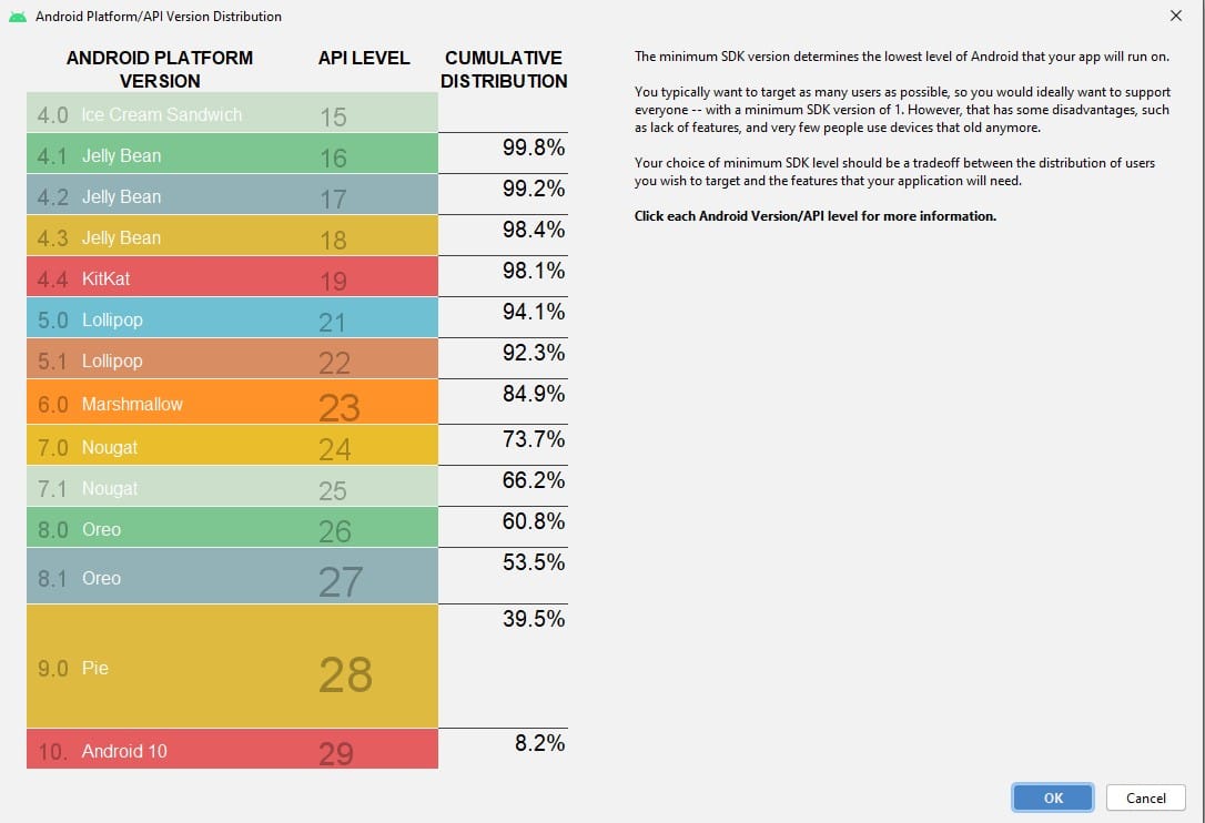
Now, Google shows a “collective distribution” percentage on the Android Studio’s version of the Distribution dashboard. For example, if a developer chooses to keep his app’s minimum support to Android Oreo 8.1, he can only target 60.8% Android users worldwide.
Even if Google has eradicated the distribution dashboard from the web, we will keep bringing the latest figures for the interested.