Apple Launches New MacBook Pro, Adds Touch Bar And Kills All The Ports You Need
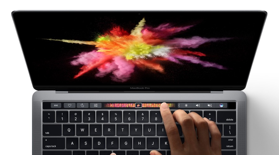
Short Bytes: At its MacBook launch event, Apple unveiled the new MacBook Pro. It’s more powerful, thinner, and more appealing. Apple has also added a secondary display, which is also a touchscreen, that shows contextual tools and suggestions for faster input. Apple, however, decided to show some more courage and replaced the vital ports by four Thunderbolt 3/USB-C ports.
The display of the new MacBook Pro looks beautiful, the specifications look promising. But, the port situation on the laptop looks like one step forward, one step back.
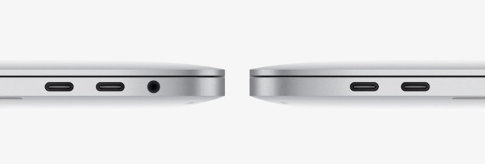
Firstly, Apple has decided to ditch MagSafe, the magnetic charging connector that was often called the best feature of MacBook. It showed Apple’s obsessive attention to detail. It was a magnetic cable that attached on its own and ripped off easily.
Apple has also removed the HDMI port, SD card slot, Thunderbolt 2 ports, and standard USB port. All of these, and MagSafe, have been replaced by four Thunderbolt 3/USB-C ports. Fortunately, the Apple design geeks have spared the headphone jack.
Apple might argue that USB-C/Thunderbolt 3 are the ports of the future, they are smaller in size, they offer faster data transfer and whatnot. But, these arguments don’t make sense to a user, and it shouldn’t, who has tons of devices. Now, you’ll need a dongle to connect all your devices, including your own iPhone. While Apple is calling wireless the future, it’s pushing the users to carry around more dongles and cables.
Apple MacBook Pro looks like a great piece of hardware but it isn’t perfect. Apple needs to understand that removing some of the most basic functionalities from its devices, hoping that users will someday become habitual, is just the opposite of the basic principles of good design.
Did you find this article helpful? Don’t forget to drop your feedback in the comments section below.
Also Read: Surface Studio — Microsoft Launches Its Ever First Desktop PC


