The Pixel Launcher Still Sucks Despite The Buffs It Received In Android 12
After more than six months of developer previews and beta updates, Android 12 recently entered hit platform stability in the Beta 4 update. The OS has received many features and improvements over Android 11, some of which are the Material You theming engine and lots of UI changes.
Google pushed the final Android 12 Beta update yesterday, which improves the speed of the search bar in the Pixel launcher. It’s a great Android launcher, but even after all the buffs and “improvements” that it received in Android 12, it still sucks. Here are the reasons why.
Why The Pixel Launcher In Android 12 Still Sucks
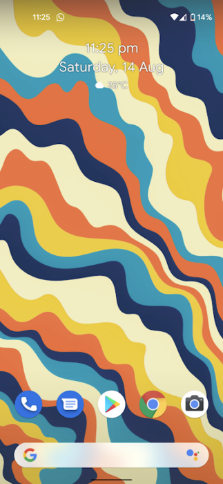
The Pixel launcher is one of the most simple and elegant-looking launchers out there, and that’s precisely why it sucks. Here’s the list of features that will make it better.
1. Hide App Labels
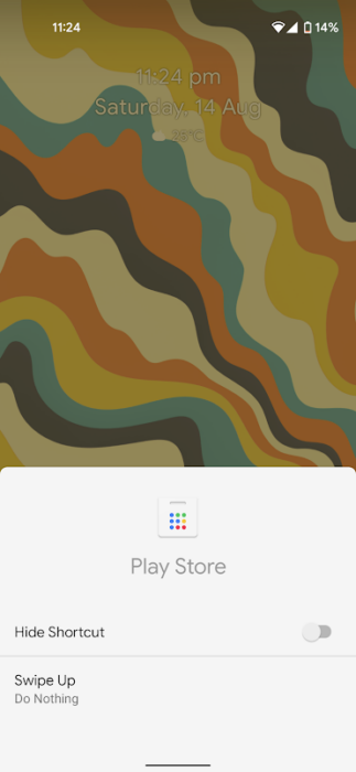
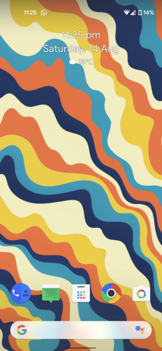
One of the reasons I use Lawnchair is that is; you can hide apps labels. If you have a banking app or any other app that you don’t want anyone to see, all you need to do on Lawnchair is hold the app icon and click on the hide app label. It’s that simple.
You can find the hidden apps by typing their names in the dock’s search bar. I’m currently using Android 12, and because I use the Lawnchair app, I miss out on the custom-themed icons that Material You creates in the Pixel Launcher, which sucks.
2. Customize Individual App Icons
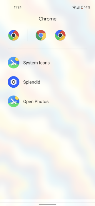
Another great feature in Lawnchair is the ability to customize individual app icons. The feature allows you to change an app icon from the list of custom app icons apps you have installed or select from photos. While I don’t use this feature much, I know many people like to customize their Android devices to the fullest and might like this feature.
3. Support For Icon Packs
I’ve already referenced Lawnchair a couple of times, and that’s because it’s one of the most feature-rich launchers and not because I’m a fanboy. Support for icon packs is another thing the Pixel launcher lacks, and while this might not be the most preferred customization feature, I can’t live without custom app icons as I eventually get bored of the stock ones.
4. Option To Customize The Search Bar
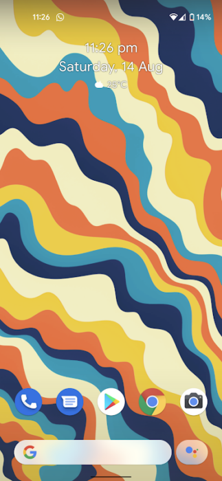
This is where, I believe, we enter the customization enthusiast’s territory. While this would not make a huge difference in functionality, having smaller customization tidbits is what makes launchers like Nova, Hyperion, and Lawnchair more appealing, and I see no reason why Google shouldn’t add enthusiast features in the Pixel launcher.
If you think the Pixel launcher sucks, we have a list of the best third-party launchers for Android. Which Android launcher do you use? Do you like it? Let us know your thoughts and opinions in the comments section below.

