Android 12’s “Material You” Is Nice, But What’s Up With Everything Big?
Seven years after the introduction of the Material design, Google has announced a new design for its Android ecosystem and called it “Material You.” Speaking of the new visual change at the I/O event, Google calls it a “humanistic approach to design.”
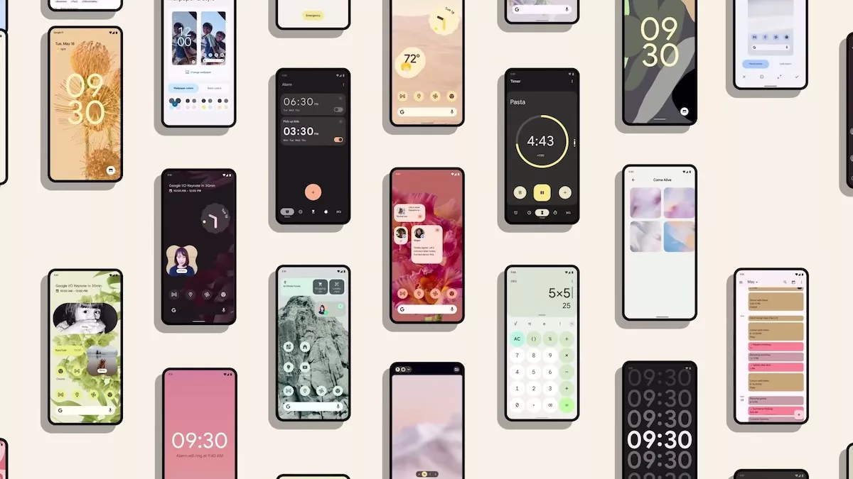
As the name suggests, it focuses on providing a personalized approach. This would mean wallpaper-based theming on your Android 12 device. Google will extract color from the wallpaper and will run it consistently through the entire UI including the notification shade, the lock screen, the volume controls, new widgets, and more.
Some of the visual changes part of the Material You are live on the Android 12 beta, while wallpaper theming and other big changes will arrive with the stable version of Android 12.
Big tiles and toggles are not everyone’s cup of tea
Among all the new changes, several UI elements have been tweaked and made bigger.
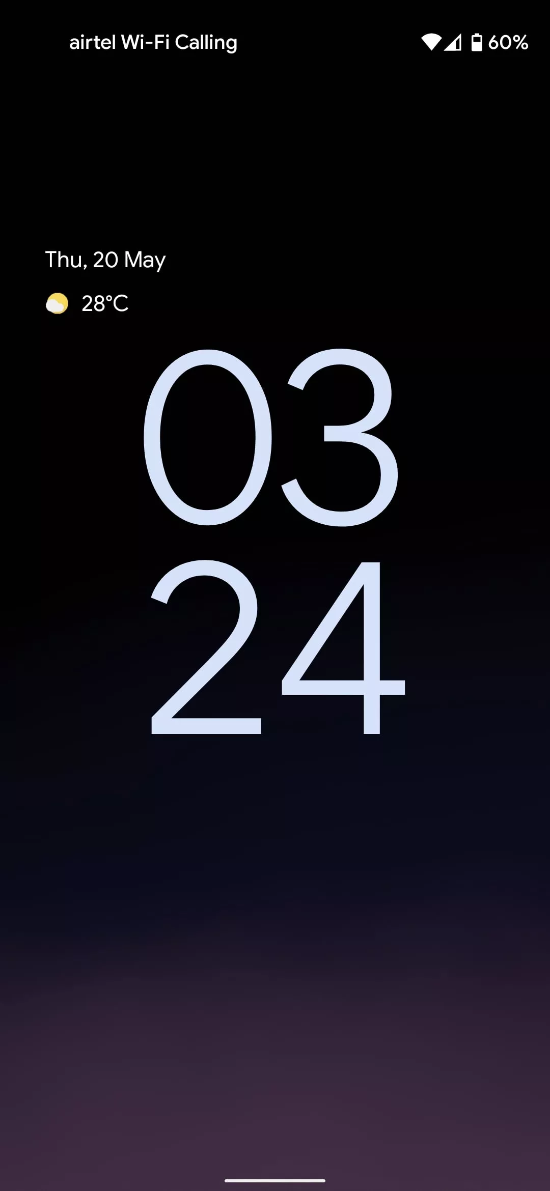
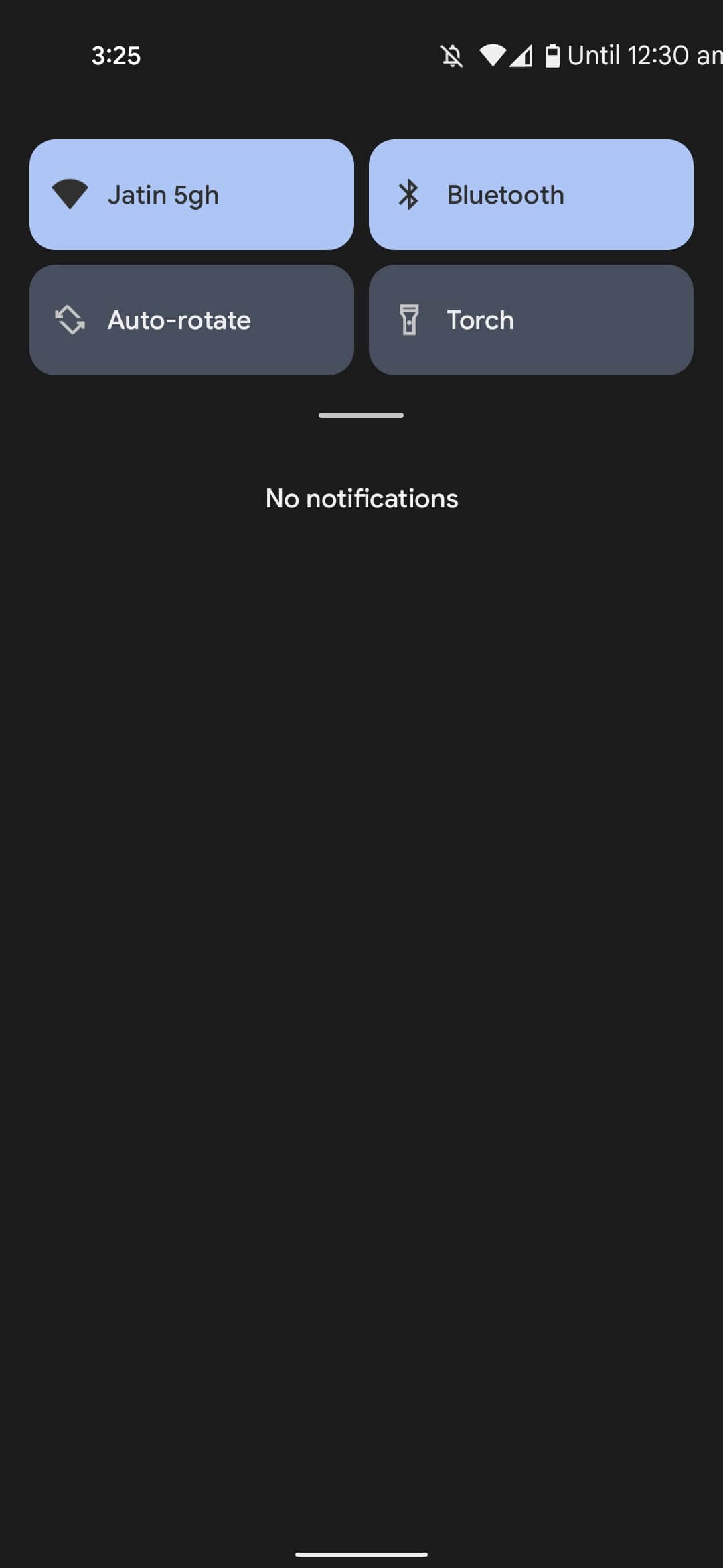
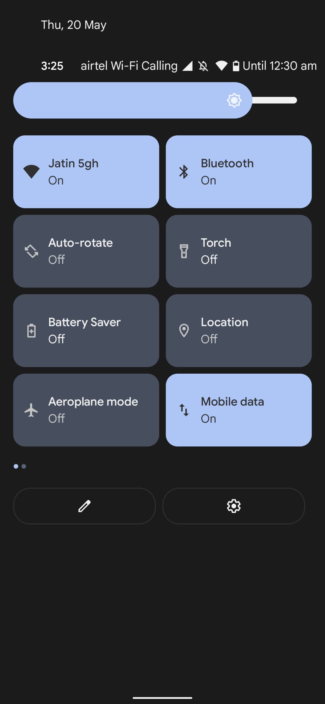
Starting with the lock screen that now features a gigantic clock to the quick settings menu, which encompasses big square tiles — everything is just bigger now. Even the brightness and volume slider are huge.

Google seems to have picked up on the idea from OneUI which follows a similar approach of having large UI elements. It has also added an in-house one-handed mode that Samsung users have had for years.
The visual overhaul might look good on bigger smartphones, but all of this looks weirdly out of place on my Google Pixel 4a, which has a 5.8-inch screen.
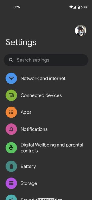
The design extends to the Settings page as well where you will notice bigger headers and icons. When the change first arrived, the first thing I looked up was whether or not I had accidentally scaled up the display size. But I didn’t, and the worst part is there is no option to revert it to the way it was.
You can lower the display size but then all the UI elements will go short such as text size, the app icons on the home screen, etc.
I prefer items on my smartphone crisp and sleek, that’s why the OnePlus UI has always made sense to me. OnePlus smartphones are bigger in size, but you get to keep everything short, which adds to the aesthetic look.
But now I am left with no choice but to accept gigantic blocks in Android 12. There is an option to install a third-party launcher that is based on Android 11, but then I would have to sacrifice the true Pixel experience.
It’s understandable that Google wants to make things easier to reach since most smartphones have 6-inch or bigger screens. But it should have also left users with the option to switch back to the previous theme.
Some might like the new bubbly toggles and a large clock on the lock screen in Android 12, but it is certainly not my cup of tea.