Google Will Improve iPhone X-like Gestures Of Android P In Next Preview

At its I/O 2018 developer conference, Google announced the second Android P developer preview. The company unveiled a long list of new features coming to the world’s most popular mobile operating system. While many of the features were powered by AI, one of them was blatantly copied from iPhone X.
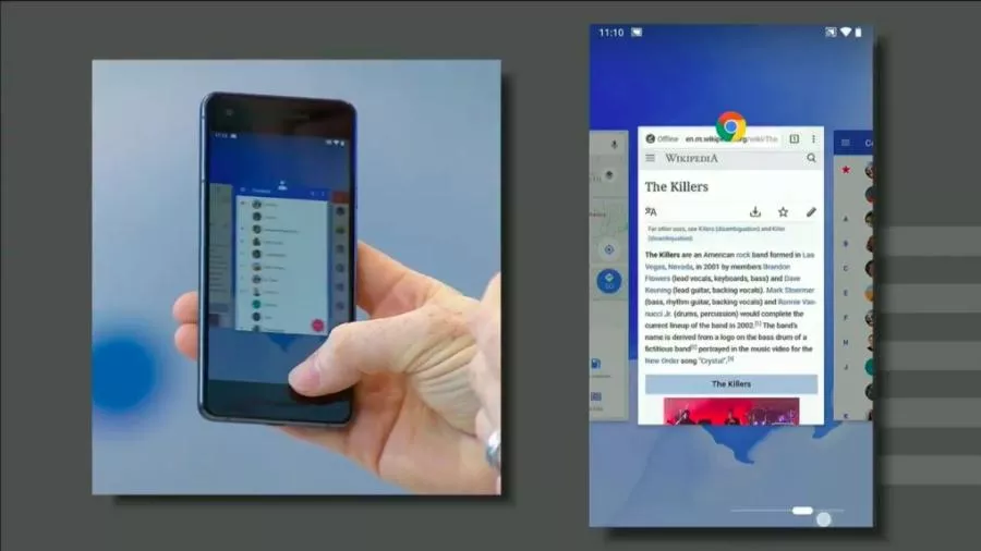
In a previous article, we’ve already described how to use this feature and replace the traditional button layout. The system uses a single, pill-shaped button at the bottom screen to navigate your way around the operating system. However, many users, including me, have called this feature half-baked and unpolished.
In response to these reports, probably, Android team’s Dave Burke has said that Android P’s navigation system will get “usability upgrades” in future previews.
“I am keenly aware that our first interaction with Google’s redesigned navigation scheme comes as an opt-in toggle inside a developer beta, and that this is all subject to change — significantly.”
According to Android Central (Via XDA-Developers), Burke is already using a newer version of Android P with an improved gesture system. Apart from this, we don’t have any further details at the moment.
What are your views on Android P’s iPhone-X inspired navigation gestures? Let us know your thoughts in the comments section and keep reading Fossbytes.
Also Read: Google Takes Legal Road To Bring “Regular” Security Updates To Android Devices


