This Open Source Project Makes Any GitHub Repo Look Like Windows 9x?

Microsoft’s recent acquisition of GitHub bagged a ton of negative reviews across the web and many developers even shifted their code to alternative platforms.
Still, the GitHub is frequented by many and one of them is Alexander Prokhorov (Athari) who has come up with a rather fun project aimed at making GitHub more Microsoftish.
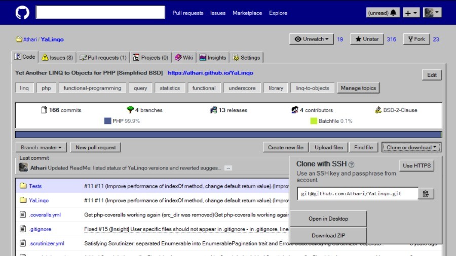
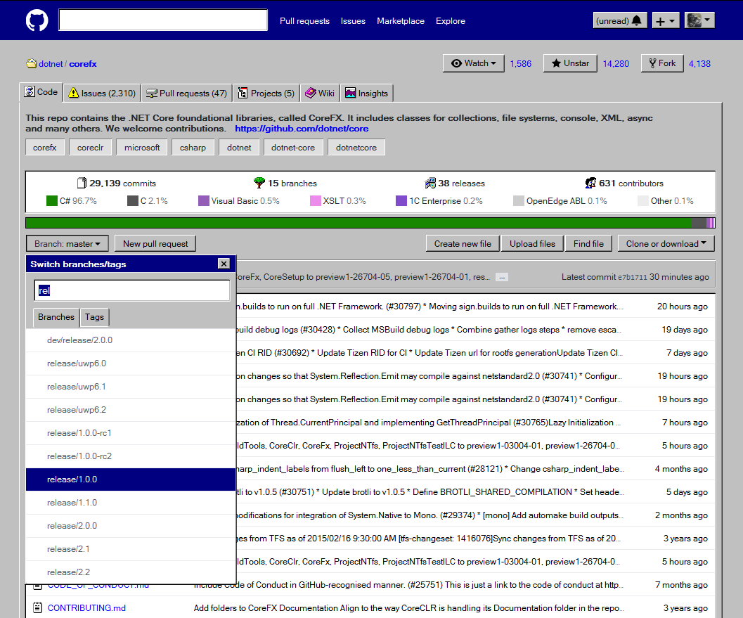
Athari has created a CSS user style named CSSGitHubWindows which transforms the UI of almost any GitHub repo with near “pixel-perfect reproduction” of various elements like buttons, windows, tooltips, etc.
Among the changes, some icons now look the ones from Windows 9x, repository stats are displayed as shell list box and various group boxes have been titled.
According to Athari, the project is currently a proof-of-concept (Alpha) and only some parts of the website have been fully transformed.
How to enable it?
You can try CSSGitHubWindows on Google Chrome and Mozilla Firefox. To do so, you need Stylus or Stylish extensions.
In case you go with Stylus, open the CSS file compatible with it and click on “Install Style” button. For Stylus, you can find the CSS style using this link. Click on “Install with Stylish” button.
You can know more about this open source project by visiting its GitHub repo. Try it and tell us your experience in the comments.
Also Read: Raspberry Pi’s Own App Store Is The Newest Reason To Love This Mini Computer


