How To Use iOS 14 App Library: A Good But Half-baked Feature
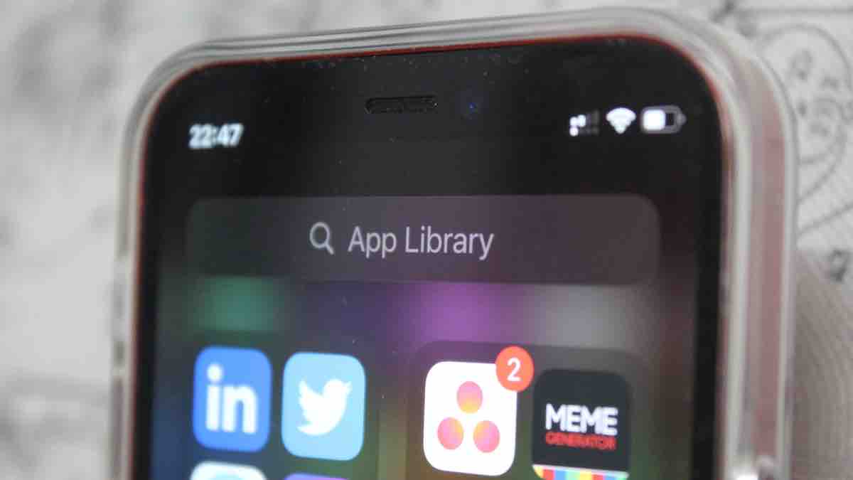
We received many new features with the iOS 14, and one of them is the App Library. A vertically scrolling app-drawer on the iPhone home screen is certainly welcome, but it could be made better. I’ve been using iOS 14 for a while now and I’ve found myself stumbling upon the App Library and using it.
If you closely observe the Apple ecosystem, it’s pretty clear that the company has now taken a more competitive approach. The App library, widgets, privacy controls, and iOS 14 as a whole are proof of that. Anyway, let’s talk about the iOS 14 App library now, a feature that makes perfect sense on the iPhone, but would make more sense on an iPad.
How To Get The App Library?
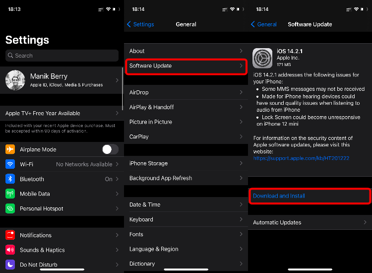
If you’re using an iPhone 6s/iPhone SE (first generation) or later, your phone is compatible with iOS 14. You can check out the list of all compatible devices here. You can get App Library and other iOS 14 features when you update your phone. You can do it by going to Settings > General > Software Update > Download and Install.
Also Read: 7 Big iOS 14 Hidden Features That You Should Know
Where Is The iOS 14 App Library?
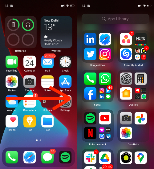
Like everything on iOS, the App Library also has a fixed place. Keep Swiping left from your home screen and you’ll stumble upon it. Once there, you’ll see all your apps neatly organized in various categories. On the top of the App Library, you’ll see a search bar.
How to Use App Library iOS 14?
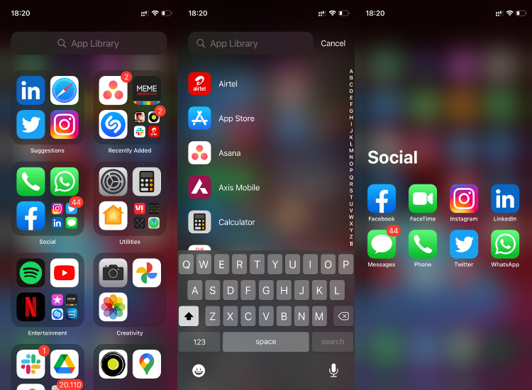
- Tap the search bar to alphabetically see all your apps, and search for particular apps.
- On the top left, you’ll find Suggestions. These are the apps that your iPhone thinks you’re likely to open next.
- You can access the full-size icons in the library with one click, and if you see 3-4 icons grouped, tap on them to expand that category.
- Then there’s a ‘Recently Added’ section, where you can find your new apps.
- Lastly, there are fixed categories like Social, Utilities, and Entertainment.
Pro Tip: Pull Down from anywhere on the screen when you’re in the App Library to go to the search bar.
If you keep a lot of apps but don’t want a lot of pages on your iPhone’s home screen, the App Library can help you do just that. Here’s how to cut the clutter on your home screen
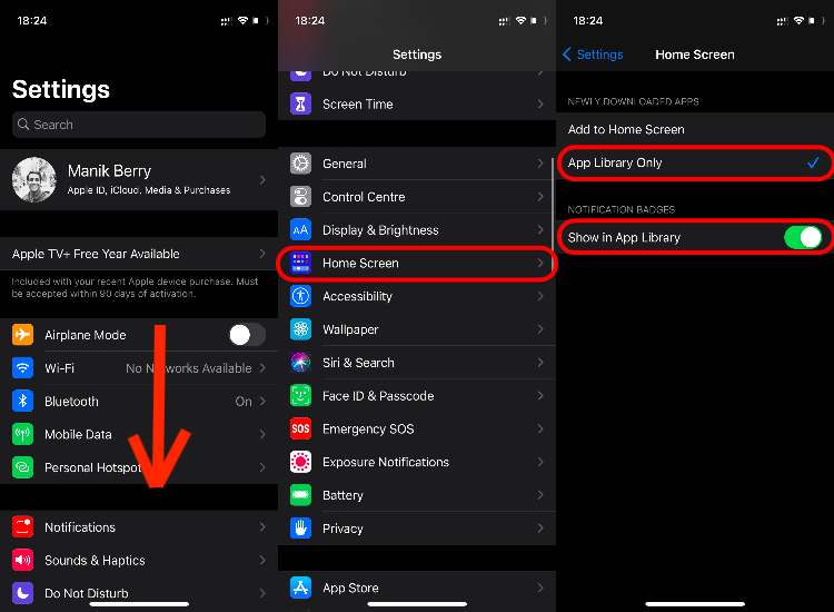
- Go to Settings > Home Screen > Select “App Library Only”
- You can also tick on “Show in App Library” to receive notification badges in the App Library.
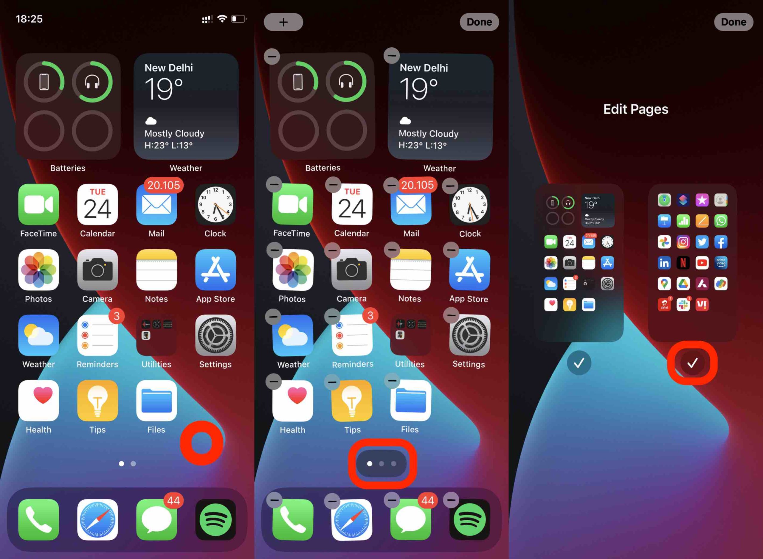
- Now go to your home screen, enter Jiggle Mode (long tap anywhere) > Tap on the dots at the bottom of the screen > Uncheck the pages you want to remove
- Once you do this, you’ll only see the selected pages along with the App Library on your home screen.
- If you want to add an app to the home screen from the App Library, go to the App Library > Long press on the app > drop it on the home screen.
How To Delete App Library?
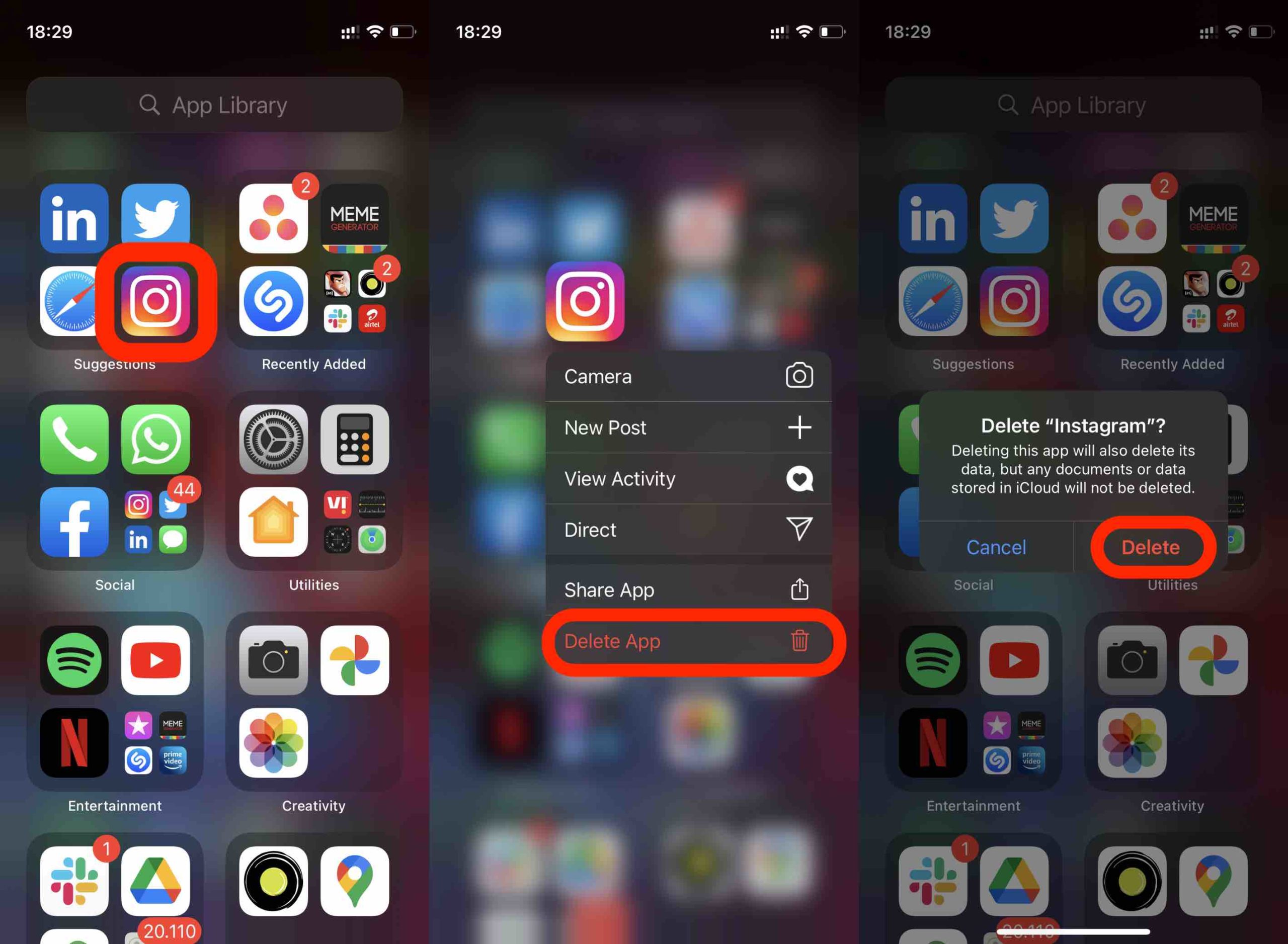
You can delete apps from the App Library, but you cannot delete the Library itself. If you’re here to know how to delete or edit App Library, you’re not in luck dear friend. If you want to delete the apps from App Library, here’s how to do it:
Go to the App Library > Long tap on the app you want to delete > Tap “Delete App” > Delete.
There’s currently no way you can delete or even move the categories around Apple’s latest addition to the iOS. Simply put, you can use it or not use it, it’ll be there, and it’s one of the things I didn’t like about it in the first place.
Good But Half-Baked
Now that the features and limitations are out of the way, let’s get to the usability part. Android phones have had app drawers and categorically-organized apps for years now, no complaints here. The complaint is that we still can’t customize or edit iOS 14 App Library. It simply remains the way it is. While I’m okay with getting used to the current layout, it’ll be nice to be able to move the sections.
By default, the App Library has Arcade, Information & Reading, and Health & Fitness tab at the bottom. I just want to be able to bring the Info & Reading tab up to the top, and the Library isn’t currently letting me do it. Another thing is that you can’t add widgets on top of the App library. So it’s a simple, sorted, welcome addition, but I think it’s half-baked because customization is still limited.


