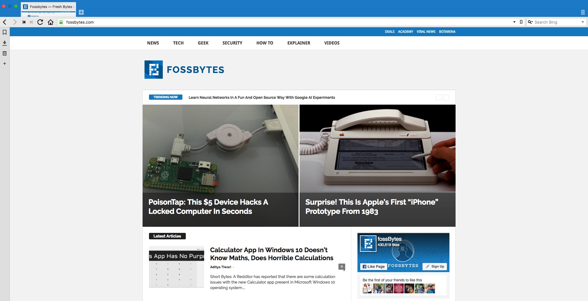
Refreshing Fossbytes — Our v3.0 Puts User Experience And Encryption First

Fossbytes was started a couple of years ago. Since then, it has grown to become a popular and reputable sources of technology news on the internet. Now, we, cover different spheres of the tech world like security, gadgets, startups, programming, Windows, Linux, and general technology news, with a special affection for open source, of course.
Ever since we redesigned our logo in July, we were planning to bring another big change to Fossbytes. The idea wasn’t limited to changing the look and feel of the website, it was about bringing a fresh website that would make the online experiences of our readers a lot better.
v3.0 Gulab Jamun (An Indian sweet dish) extends the clean design principles of v2.0 Samosa Chat with the help of Newsmag theme for WordPress. We have worked a lot over the past couple of weeks to customize the theme, tweak its code, and figure out the best combinations.
The new home page puts the content and user experience first by trying to balance the latest and featured articles. The biggest news stories are displayed in the top grid, which follows the latest articles. In the right sidebar, one can see the popular articles that are populated from the past one week.
Fossbytes v3.0 also focuses on making videos content a bigger part of the website. Our home page features a customized playlist of videos from our YouTube channel. You can also access the dedicated Fossbytes Videos page from the menu.
 Also, we’ve encrypted Fossbytes. This might seem like a little step, but encryption makes it harder for other websites to mimic us by delivering a fake version of Fossbytes. Now, delivering 100% safe content from our servers to your browser over HTTPS is possible.
We hope that you liked the new redesign. Don’t forget to leave your feedback in the comments section below.


