Here’s How GNOME Plans To Improve The Upcoming Version 3.38

After wrapping up the release of the latest GNOME 3.36 “Gresik,” the GNOME UX team is gearing up to improve its several components that might land in the next version 3.38.
It goes without saying that the v3.36 is already one of the most undisputed feature-rich releases bringing out-of-the-box user experience. For instance, the redesigned login and lock screen with multi-user support which you can now open by either sliding or clicking. New “Do Not Disturb” toggles, Parental Control Features and many more features contribute to making GNOME 3.36 one of the best desktop environments. Moving on to the next release, let’s see what the dev team plans to enhance in the GNOME shell.
Alphabetical Applications Grid With Frequent Apps
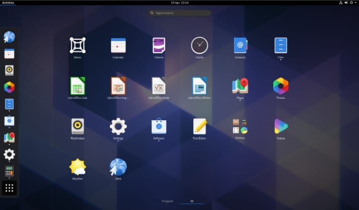
Unlike KDE’s application launcher that’s similar to Windows, GNOME contains all applications in a grid-like structure similar to smartphones. Additionally, GNOME maintains two sections: one for frequent apps and the other for all apps in alphabetical order.
Hence, you can find your favorite app in either section. Overall this method does not bring a better experience. As a result, the UX team targets the launcher to make it more engaging, personal and easy to find any applications.

Elements Arrangement In Activities Overview
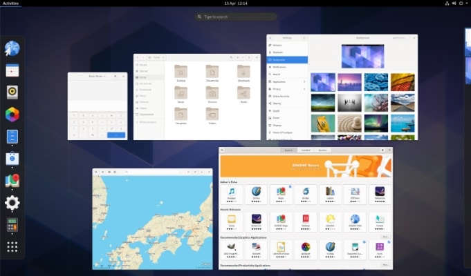
If you click on the “Activities” label, present at the top left corner of your screen, you’ll see an overview containing window thumbnails, dash, search and workspaces. You may spot no issues here but the team believes the arrangement of elements could be improved further.

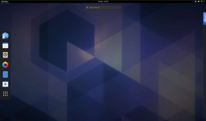
Moreover, if you open the overview with no application opened, you will find the middle section empty.

So, the overview section needs a lot of renovations that can enhance the user experience. That is why the dev team included the Activities overview among the improvement list.
Workspace Navigation Using Touchpad
Navigating between several workspaces using touchpad gestures always feels awesome and gives better control (recalling the macOS touchpad). Hence, GNOME also supports the four-finger swipe up and down for navigation.
But if you use Linux distro with GNOME, you must find it hard to go in and out of the overview. Navigate between different areas like the search field also doesn’t work so smoothly.
Keeping that in mind, the GNOME UX team is looking to smoothen navigation around spaces. Also, instead of making several gestures for each movement, they plan to implement a simple method.
Combining Them All
Overall, if we combine all the upcoming improvements, we would have an advanced and much better package of the desktop environment. Since the work for the above-mentioned features is already under process, we can surely expect to get it all in GNOME 3.38.


