GIMP Removes Annoying “You Can Now Drop Dockable Dialogs Here” Message
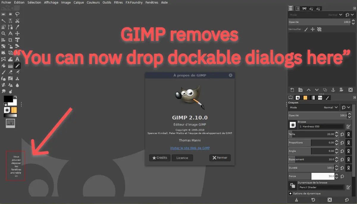
If you know how to organize UI in GIMP, then you must have been annoyed by the reminder label “You can now drop dockable dialogs here.”
Hence, as complained by most of the GIMP users, the message will no longer be displayed in your empty workspace layout. While maintaining the flexibility to arrange the dialog on screen, the targeted dock area will be highlighted once you begin the drag operation.
The unwanted label is a long-sought demand. Last year, issue #1457 was opened when a bug was reported in 2018.
As GIMP is preparing for the next point release of 2.10.x series, they shared the new fix on their official Twitter handle.
New in development: the dreaded "You can drop dockable dialogs here" message in the toolbox is gone :) Docking areas are now highlighted when you start dragging a dockable dialog. Patch by Ell. To be released in 2.10.16 soon. pic.twitter.com/kKbIaROeC3
— GIMP (@GIMP_Official) February 2, 2020
The new feature added in the 2.10 milestone, which will feature in the next point release 2.10.16.
For more updates on Linux and open source releases, keep reading Fossbytes.


