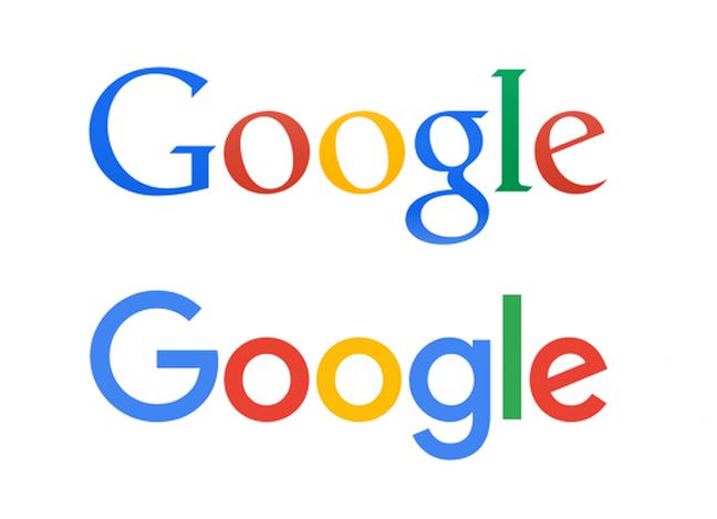
Google Gets a New Logo
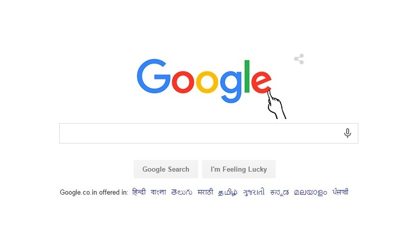
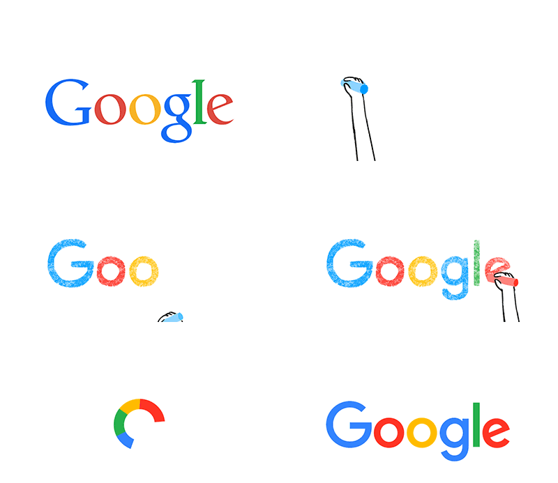 Short Bytes: Google has changed its logo and this redesign is a reflection of the latest Alphabet restructuring. With this logo, Google expresses the varied paths Alphabet aims to take as a parent company.
The company has said that the new logo and branding is intended to showcase company’s futuristic approach and aim to improve the experience across all screen sizes. Apart from the logo, the company will be using a four-color “G” that replaces the previous blue “g” icon.
Google says on its blog: “Today we’re introducing a new logo and identity family that reflects this reality and shows you when the Google magic is working for you, even on the tiniest screens.”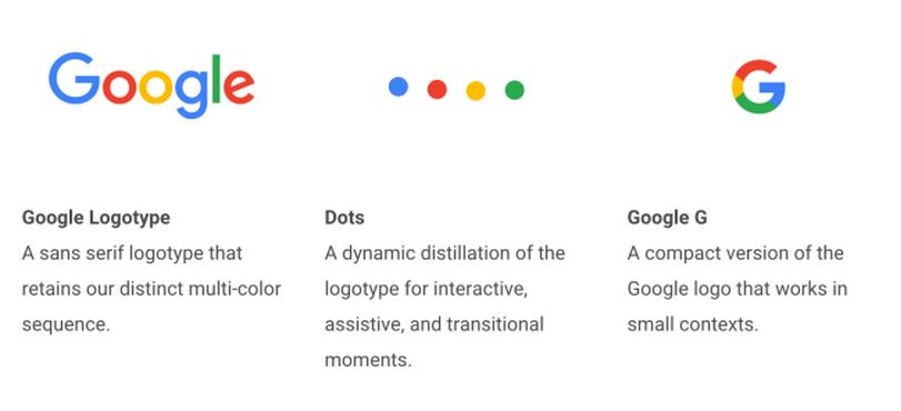 “As you’ll see, we’ve taken the Google logo and branding, which were originally built for a single desktop browser page, and updated them for a world of seamless computing across an endless number of devices and different kinds of inputs (such as tap, type and talk),” company says.
Watch the video telling Google logo’s journey:
What do you think of Google’s new logo? Tell us in the comments below.
Images: Google.com
[adinserter block=”12″][adinserter block=”13″]
