What Is Fluent Design System? How Is Microsoft Building The Most Beautiful Operating System?
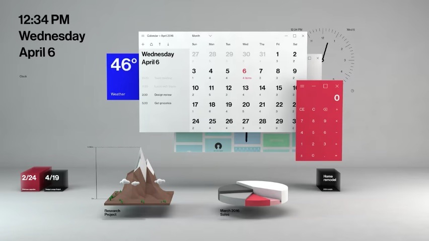
Short Bytes: At Build 2017 Day 2, Microsoft made its Project Neon official. Now called Fluent Design System, this project will slowly change the look and feel of all Windows apps. It’s based on five fundamentals: light, depth, motion, material, and scale. Transition to Fluent Design System will take place slowly over the course of next few months.
We’ve been reading about Project Neon from past few months; we’ve also seen some leaks which suggested the basic look and feel of Windows operating system in future. At Build 2017 Day 2, Microsoft made Project Neon official with a name, i.e., Microsoft Fluent Design System. This design system extends the work being employed in the current version of Windows 10, i.e., Microsoft Design Language 2 (MDL2).Some of the elements of Fluent Design System will be implemented in Windows 10 as a part of the Windows 10 Fall Creators Update. This next big Windows 10 update will arrive in September and you can read our dedicated Fall Creators Update article to more about the same. Fluent Design System is being seen as a success to Microsoft’s Metro Design.
Recommended: Ubuntu Linux Arrives In Windows Store, Fedora And openSUSE Also Getting Support
WTF Is Fluent Design System?
Fluent Design System will bring a slow change in Microsoft’s design philosophy. If you’re thinking that it’ll only bring changes to Windows 10, think twice. Apart from Windows, iOS, and Android apps, Fluent Design System will also govern the look of apps compatible with devices like HoloLens.
The rollout of Fluent Design System will be first delivered to the members of Insider program. You can read this article to know how to join the fast ring of Windows 10 Insider program to grab the new features before everyone else.
Microsoft has also released a video highlight the future look and feel of Windows ecosystem, apps, and devices. Take a look:
https://youtu.be/vcBGj4R7Fo0
5 Fundamentals of Microsoft Fluent Design System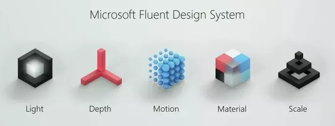
Microsoft’s Fluent design can be described using 5 fundamental elements. They are:
- Light: Light controls how user interface interacts with illumination and how it helps the users to avoid distraction.
- Depth: Depth brings parallax effect and makes use of layering. This highlights the relationship between objects and elements.
- Motion: Motion can be used to show connection, relation, and context between elements and objects.
- Material: Material allows to control an element’s texture and change as one interacts with it.
- Scale: Scale lets elements and objects to go beyond two dimensions and adapt themselves according to the size of a screen.
Here are some more pictures:

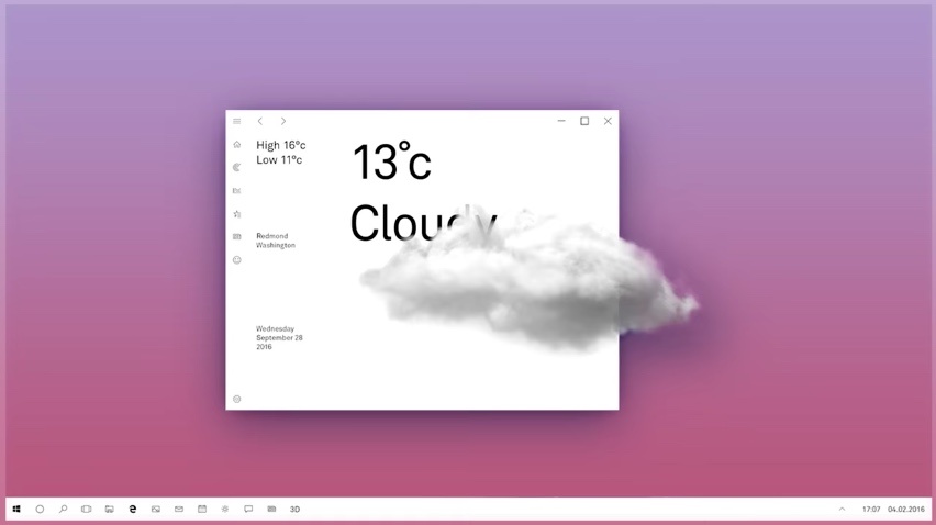 Some elements of Fluent Design System have already been seen in Google’s Material Design and Microsoft’s own Metro UI. While it’s in the early days, the mockups surely look cool.
Did you like Windows Fluent Design System? Don’t forget to share your feedback with us.
Also Read: Can We Survive On Windows 10 S Without Desktop Apps? — Alternative Apps On Windows Store

