Samsung One UI: Is It Better Than Stock Android Pie?
Earlier this year, Samsung released its flagship lineup including the Galaxy S10, S10+, and S10e. These smartphones have premium build quality and powerful hardware, which makes them a benchmark setter for the year 2019.
But there is another thing that Samsung did. It also improved the software the company puts on its phones by releasing the One UI. This comes after failing twice with TouchWiz and Samsung Experience UI.
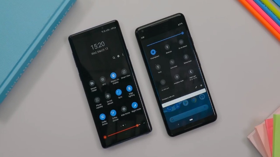
Now, Samsung is again in the market with their third skin — that’s the One UI running on top of Android Pie. And it’s quite compelling, so it’s obvious that comparisons will be made with the Stock Android. So, today I’m going to tell you about some differences that I have found while using the two software.
One UI vs. Android Pie: What’s the difference?
Fixing the problem
So the main selling point of One UI is that it’s trying to fix one big problem with your smartphone and it’s the smartphone itself. I mean all the phones are getting bigger and bigger these days, and it’s very problematic.
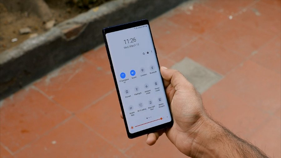
What you get on One UI is the new interface where everything has moved towards the bottom of the screen. So, it’s a lot easier for people with small hands to use their gigantic phones with just one hand.
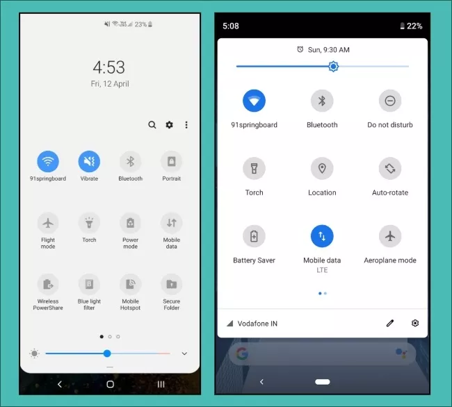
For example, in the Notifications bar, I can easily tap on most of the quick action buttons, although, it will still be tough for me to reach the WiFi and the Sound buttons.
Maybe I can put these options in the place where my fingers can easily reach. Here I want to add that I tested One UI on Samsung Galaxy Note 9 and Galaxy S10+. Both of them have a big screen, so I think that it will be even more easy to use if the size of the phone is a little small.
Still, in this case, One UI is somewhat better than the Stock Android Pie as you can quickly open the app switcher and the App Drawer. But there aren’t many quick action buttons that you can tap while using your phone with just one hand.
Also, one big problem with all the big phones is pulling down the notification bar itself. I mean you can’t do that with one hand. Yes, you can use third-party apps, and you can configure the fingerprint sensor to do the same. But I think that’s just a workaround and not the actual solution because what if your phone doesn’t have a sensor at the back, like on the Galaxy S10+?
Samsung has a fix for the problem, and you can enable the swipe gesture to pull down the notification bar. For that, you can tap and hold the home screen > go to Home Screen Settings > Turn on the toggle “Quick-open notification panel.”
It’s worth noting that it only works on the home screen. Still, something is better than nothing.
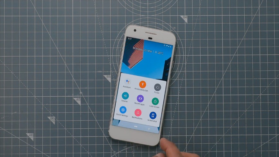
In the case of Stock Android Pie, you can enable the Accessibility menu in the Settings app. Then you can easily open the quick actions menu or the notifications panel. But as I said, it’s also just a workaround.
Better usability
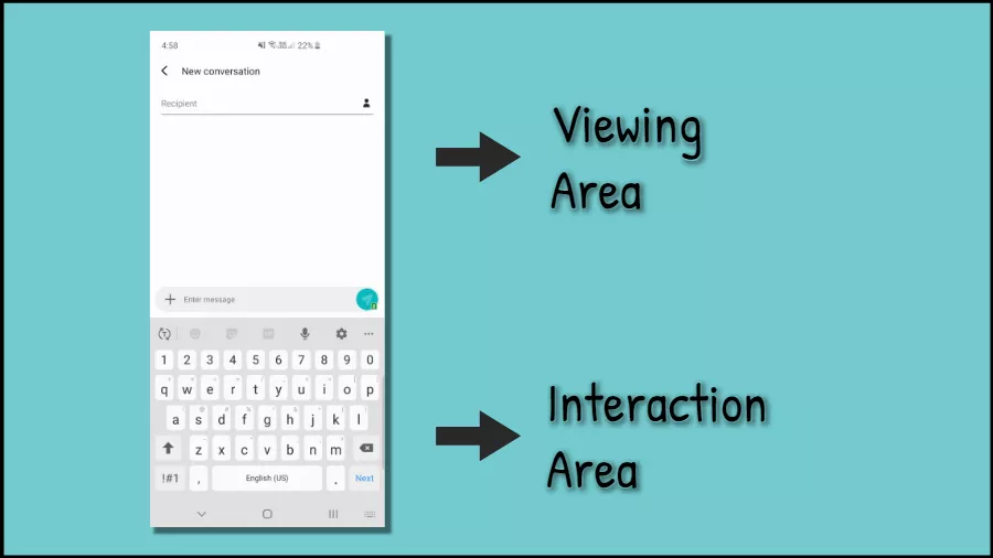
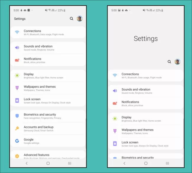
Anyway, you can see Samsung’s new design in almost every part of the software. What Samsung has done is it has divided the screen into two sections. The upper half is called the “viewing area” where you see all the content, and the bottom half is the “interaction area” where the company puts all of the controls.
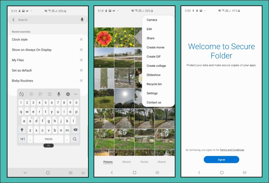
As you can see in the pic of the Settings app, the names of features are all blown up and all the tappable part has been moved down. You can go to any of the submenu options, and the same thing exists there also.
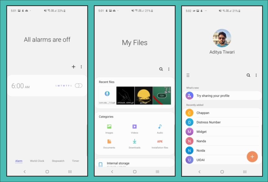
Additionally, Samsung has redesigned many of its System apps. So, all of the essential options are now well within reach of your fingers. For instance, in the Clock app, and the My Files app, Contacts, and so on. Thankfully, the company has even fixed the crappy Camera app and now it feels much better to use.
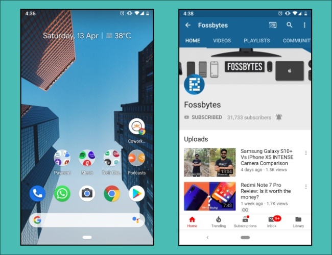
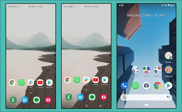
If you compare this with Stock Android Pie and Google apps, I think there is a scope for improvement. However, in some apps, a bunch of options are already easily reachable. For instance, the YouTube app is designed that way. Also on the home screen, it’s a good thing that Google has already moved the Search bar to the bottom.
Still, you’ll realize that things aren’t that easy mostly because of the size of the phone. So, here I think the One UI gets a plus point for ergonomics. And seriously, maybe for the first time, I’m surprised that I kind of like the software that Samsung is putting in its phones.
The One UI is making the phone so much usable, it has leveled up the smoothness, and it looks eye popping on the AMOLED displays on the Galaxy phones.
Also on the S10+, it fits very well with the pill-shaped display cutout. So, I don’t think it’s going to be as annoying as the Notch on other phones. Still, it’s just the beginning, and Samsung needs to work more on their software.
Better Gestures
One UI isn’t just about moving everything to the bottom of the display. Samsung has also tried its gestures, and it turns out that almost every other gesture navigation is somehow better than the Stock Android.
I’m saying this because in some way, the gestures on Android Pie actually defeat the whole point of gesture navigation. I mean you’re not getting that extra space on your screen for which it’s there in the first place. Now One UI’s gestures may not be the best, but still, you get that extra space on your screen and you can also tweak them according to your needs.
System-wide Dark Mode
One of the things that I want from almost every app and OS that I use is the Dark Mode. So, on Samsung’s One UI it is called the Night Mode. It’s not like the fake dark mode that we see on Stock Android Pie in which half of the UI is still white even when you enable the dark mode.
In the One UI, the dark mode is dark, system-wide. Actually, it’s not dark but black mode. That’s because of the OLED displays on the Samsung flagships, your phone can turn off individual pixels that are not fueling any UI element or any feature. So you get this pitch-black screen on your device that you’re not getting on stock Android Pie.
This thing saves more battery and looks more visually appealing, but I don’t think it’s that big of a deal breaker. By the way, Android 10’s first preview build is already out, and it has finally got the system-wide dark mode that we have always wanted. So yes, Google has got us covered for 2019 and later Android versions.
What else?
Apart from this, there are many other features that you can find One UI. For example, the new floating keyboard that’s already there on Android Pie, the Recycle bin in the Gallery app again which is also there on the Google Photos app. There’s also the Secure Folder and more.
Also, this time, Samsung has cut down on the bloatware, and you can remove many Samsung apps from your phone. However, Facebook and some Microsoft apps will still take up space.
On the other hand, there aren’t any third party apps on Android Pie, but Google’s apps are like bloatware these days because you can’t remove most of them. However, in this case as well, Google will let you delete system apps in Android Q.
So, who’s the winner?
Now it’s hard to pick a winner and say if one is better than the other. That’s because the One UI has just arrived, and also both the software have their list of pros and cons. But I’d like to say that One UI has lived up to my expectations and thumbs up to Samsung for making their gigantic phones more usable.
Still, I’m slightly skeptical about Samsung pushing timely updates, because it took them like four months to release Android Pie even on their flagship devices. But surely I do want to give One UI a more long-term use — maybe, like half-a-year or so.
Anyway, that’s my opinion and you can tell me yours in the comments down below. So what do you think about One UI?
Also Read: Samsung Galaxy S10+ Review: The Good, The Bad, And The Worst

