Forget Ordinary, This Internet Map Shows You Where Most Internet Users Live
Maps have been used since ages to mark out or highlight relationships between the elements of space and representing specifics in a given area. Excellent cartography gives a load of information about any place. Similar is the purpose of this map that shows worldwide Internet Population.
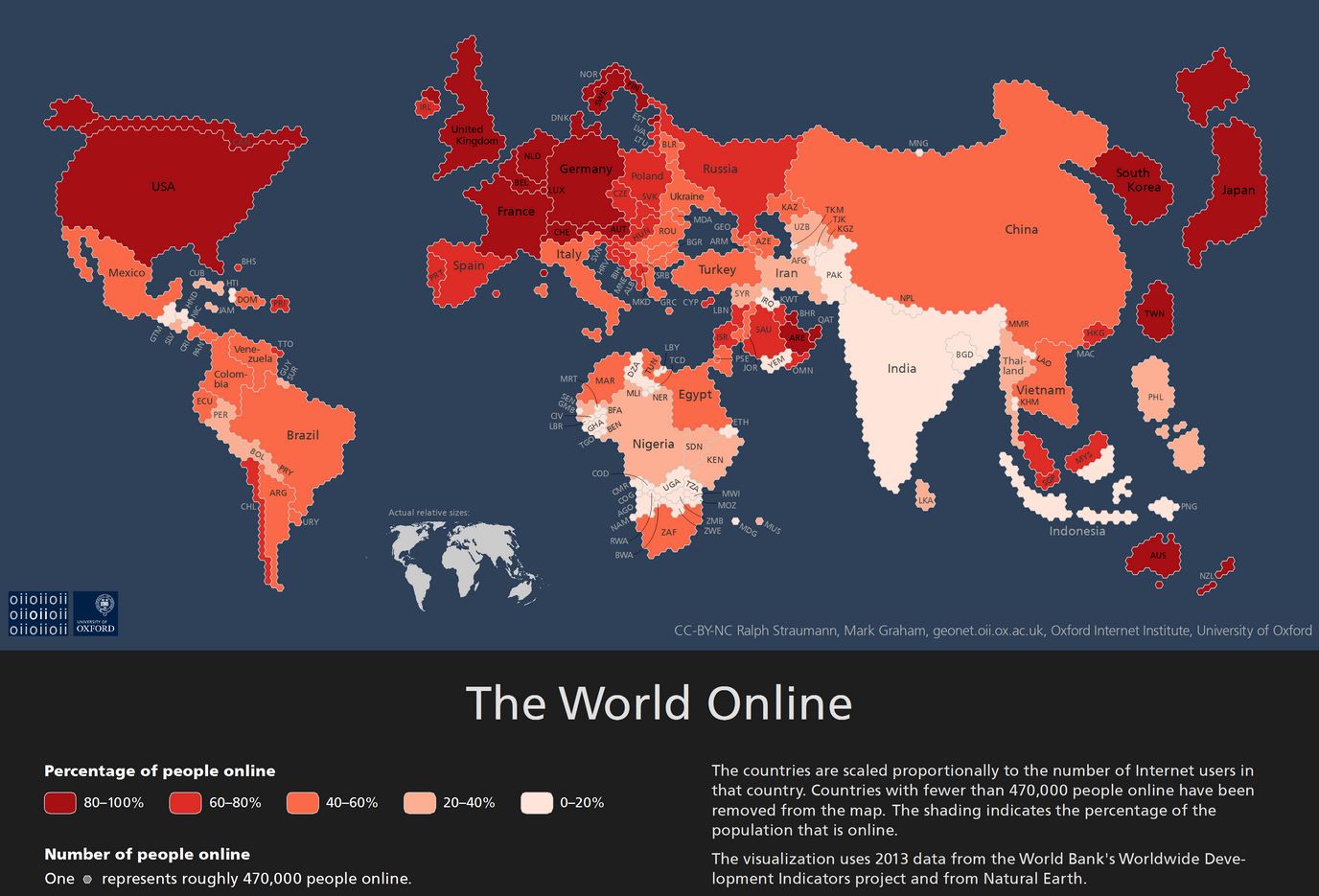
Oxford Internet Institute has generated an internet map that shows the world based on each country’s population of its Internet users. The map looks pretty similar to a normal looking map except that some of the European countries like Germany, Spain and UK have inflated; while some like Russia have shrunk. Do not worry if yours has been dwindled, some haven’t even appeared on the map.The internet map is made up of small hexagons (as a base unit), where each one represents about half a million people that are online. The map has also been color coded. Darker is the country means more of its citizens are active internet users. So the internet map shows both the total number of Internet users (the size of the country) and the percentage of population that has Internet access or, we can call it ‘Internet penetration’ (shade of the country).
Also Read: Know Which Is The Most Googled Thing in Your Country
According to the color codes in the internet map given, dark red means more than 80% users are online, whereas white means less than 20% active users.
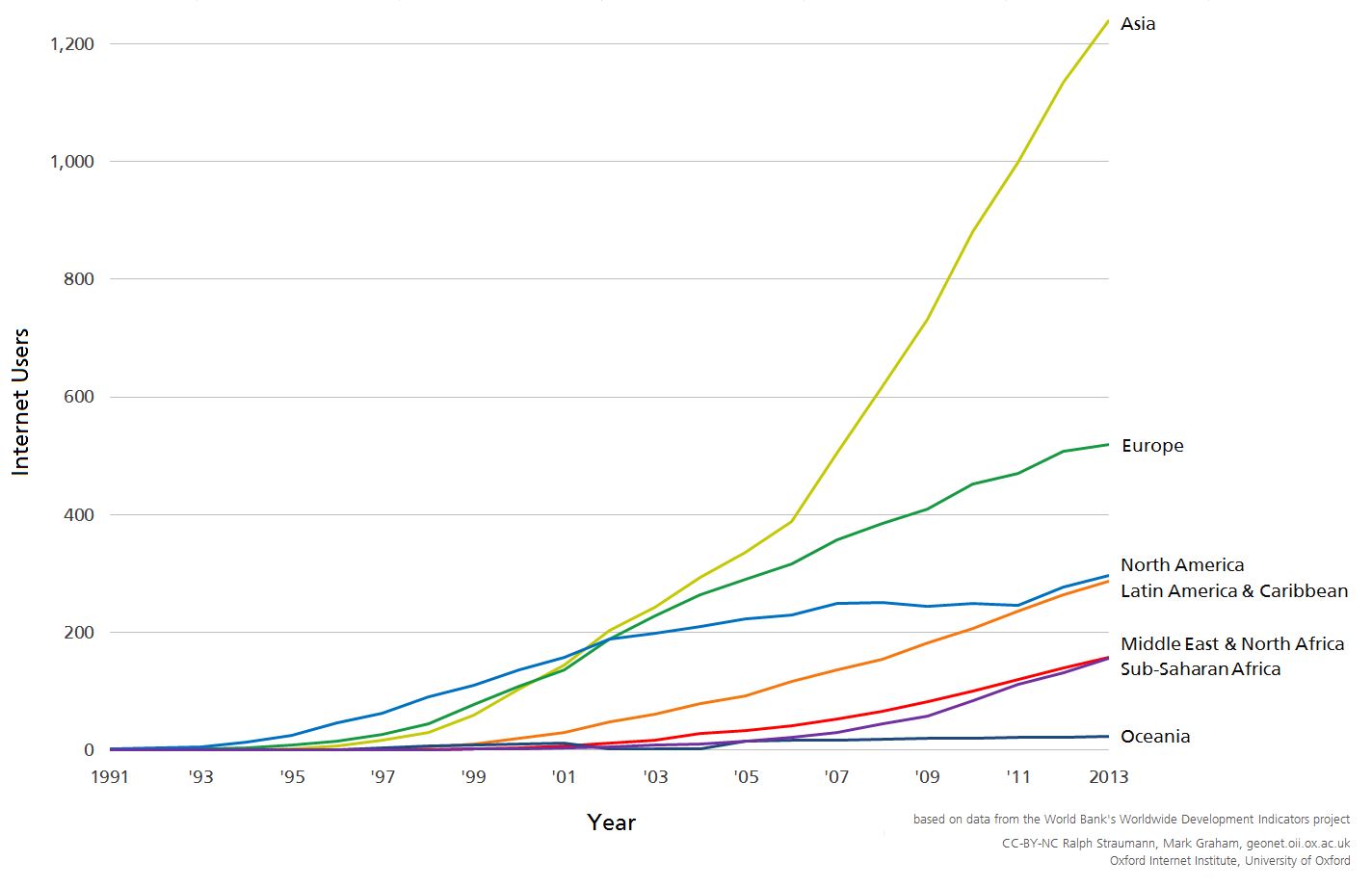
So it can be seen from the internet map that even the largest Internet countries like India have low Internet penetration. Asia is the home to largest Internet population at 1.24 billion users i.e. 46% of the world’s share.
European and some other relatively smaller countries like Japan and South Korea could be especially seen darker and enlarged in the map, showing they have a high ratio of active Internet users.
Also Read: This Real-Time Cyber-Attack Map Shows the Truth of Global Cyber War
African countries have shown phenomenal growth in its Internet population since the last time Oxford mapped the globe in 2011.
The internet map is based on the data provided by the World Bank in 2013 regarding the relative Internet users and the actual population of all the countries.
The institute’s findings show that although many countries are coming out of the shadow and growing technologically (‘Internet Use’ being one), most people on this planet are still unaware and disconnected. Slightly more than a third of the humanity has an access to the Internet presently.
Internet is one of the key sources to make the general public aware and spread knowledge amongst the masses. Governments should review such maps and take measures for the development of their countries..
Source: Oxford